
Home / Case Studies
Case studies
Three client engagements, explained in full: the client’s challenge, PRBM’s role, the creative solution, the results, and the work itself. The work shows the disciplines public-sector programs need: clear messaging for complex programs, high-volume creative production, and results that are tracked.
Complex programs, explained clearly
One consistent voice across 150+ MedPride products, and a color-coded Curewell packaging system that makes each medicine easy to tell apart.
High-volume production
Packaging, labels, product imagery, websites, Amazon listings and in-store graphics, designed and produced in-house.
Tracked results
During our partnership, HL Medical’s annual revenue grew from $1.8M to $89M+.
Case study 01 · Healthcare & medical supplies
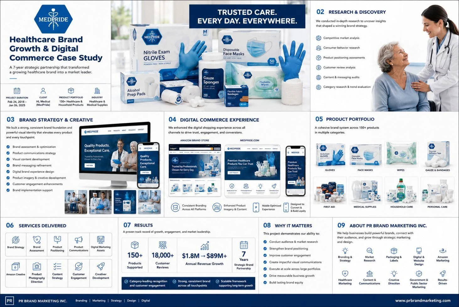
MedPride / HL Medical: a 7-year strategic brand partnership
A 7-year strategic partnership with a growing healthcare brand: research, brand strategy, product communications, creative and digital commerce across 150+ products.
- Client
- HL Medical (MedPride)
- Sector
- Healthcare & medical supplies
- Timeframe
- Feb 2018 – Jan 2025 (7 years)
- Scope
- 150+ healthcare & household products
Services
01 Client challenge
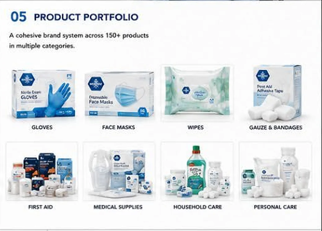
MedPride sells a large line of everyday healthcare and household products: gloves, face masks, wipes, gauze and bandages, first aid, medical supplies, household care and personal care. With more than 150 products across those categories, the brand had to look and sound consistent everywhere it appeared, and every product had to communicate clearly to the people choosing it.
02 PRBM’s role
What we delivered:
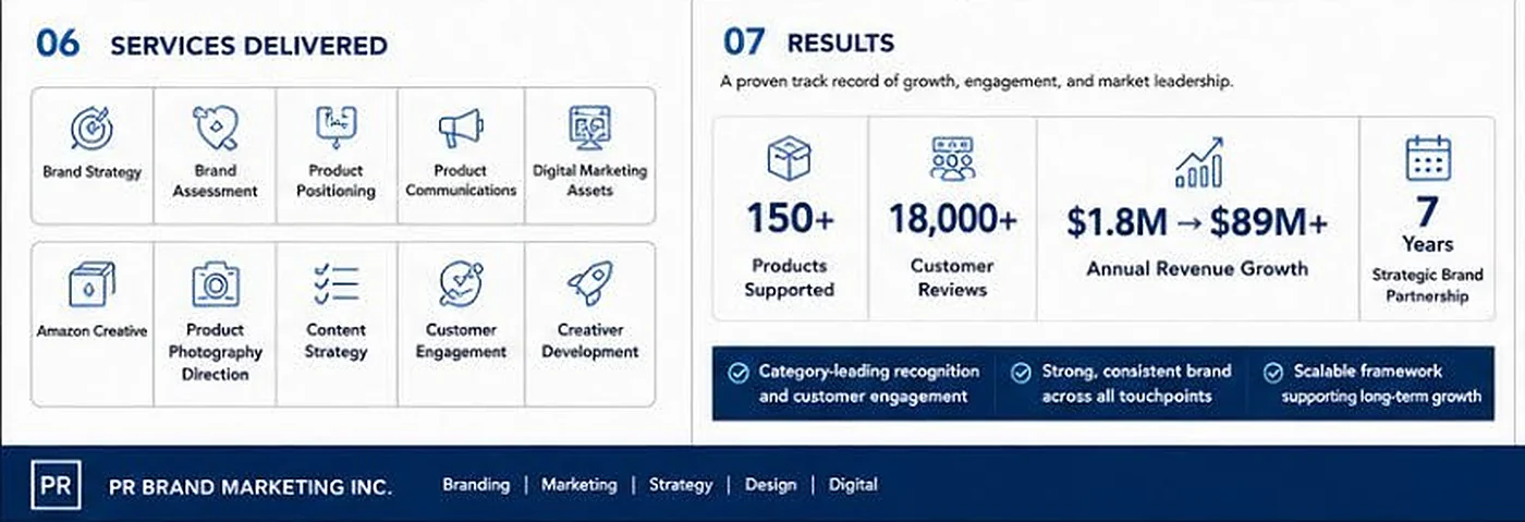
- Research & discovery: competitive analysis, consumer research, positioning assessments, customer review analysis, content and messaging audits
- Brand assessment & optimization and brand messaging refinement
- Product communications strategy across a 150+ product portfolio
- Visual content and product imagery, including product photography direction
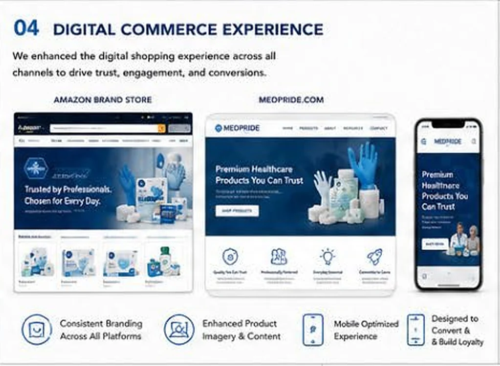
- Amazon Brand Store and Amazon creative
- MEDPRIDE.COM digital brand experience, mobile-optimized
- Customer engagement enhancements and content strategy
- Brand implementation support over the full 7-year partnership
03 Creative solution
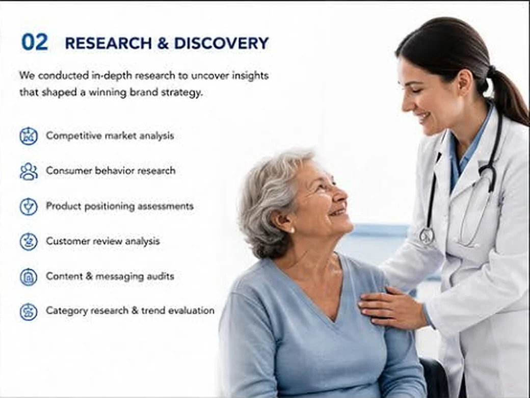
We started with research: competitive market analysis, consumer behavior research, product positioning assessments, customer review analysis, content and messaging audits, and category and trend research. Those insights shaped the brand strategy.
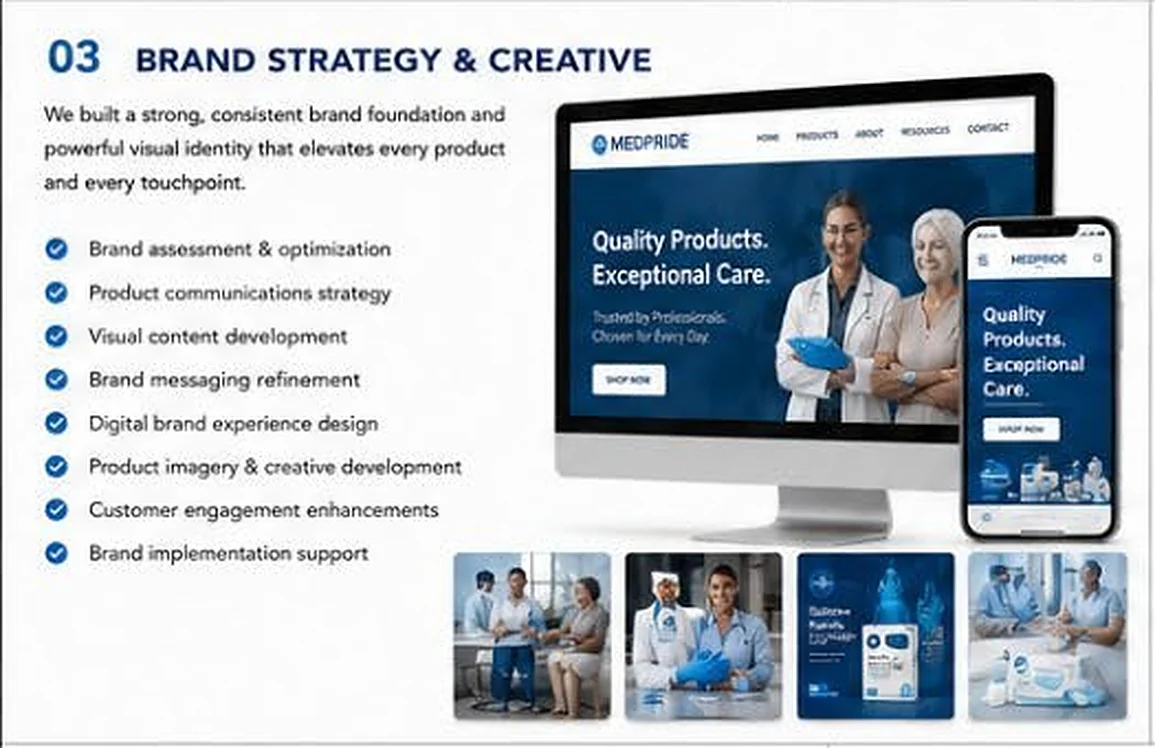
From there we built a strong, consistent brand foundation and visual identity, and carried it through product communications, imagery and the digital shopping experience across every channel. We stayed on as MedPride’s strategic and creative partner for seven years, supporting the brand as it was implemented across the whole portfolio.
04 Results
During our partnership, HL Medical’s annual revenue grew from $1.8M to $89M+.
- 150+Products supported
- 18,000+Customer reviews
- $1.8M → $89M+HL Medical’s annual revenue during the partnership
- 7 yearsStrategic brand partnership
- Category-leading recognition and customer engagement
- A strong, consistent brand across all touchpoints
- A scalable framework supporting long-term growth
Why it matters for public programs
The same disciplines carry over to agency work:
- Conduct audience & market research
- Strengthen positioning and messaging
- Improve engagement with the people you serve
- Create impactful visual communications
- Execute at scale across large portfolios
- Track measurable results
Relevant codes
- NAICS 541613 Marketing Consulting Services
- NAICS 541430 Graphic Design Services
- NAICS 541810 Advertising Agencies
- GSA SIN 541613 Marketing Consulting
- GSA SIN 541430 Graphic Design Services
- GSA SIN 541511 Web Based Marketing
Reference available. HL Medical / MedPride has authorized us to share them as a reference. Ask for contact details.
05 Gallery Our own case-study boards and designs. Tap any image to enlarge.
Case study 02 · Over-the-counter (OTC) pharmaceuticals
Curewell: an OTC medicine brand, from brand creation to digital presence
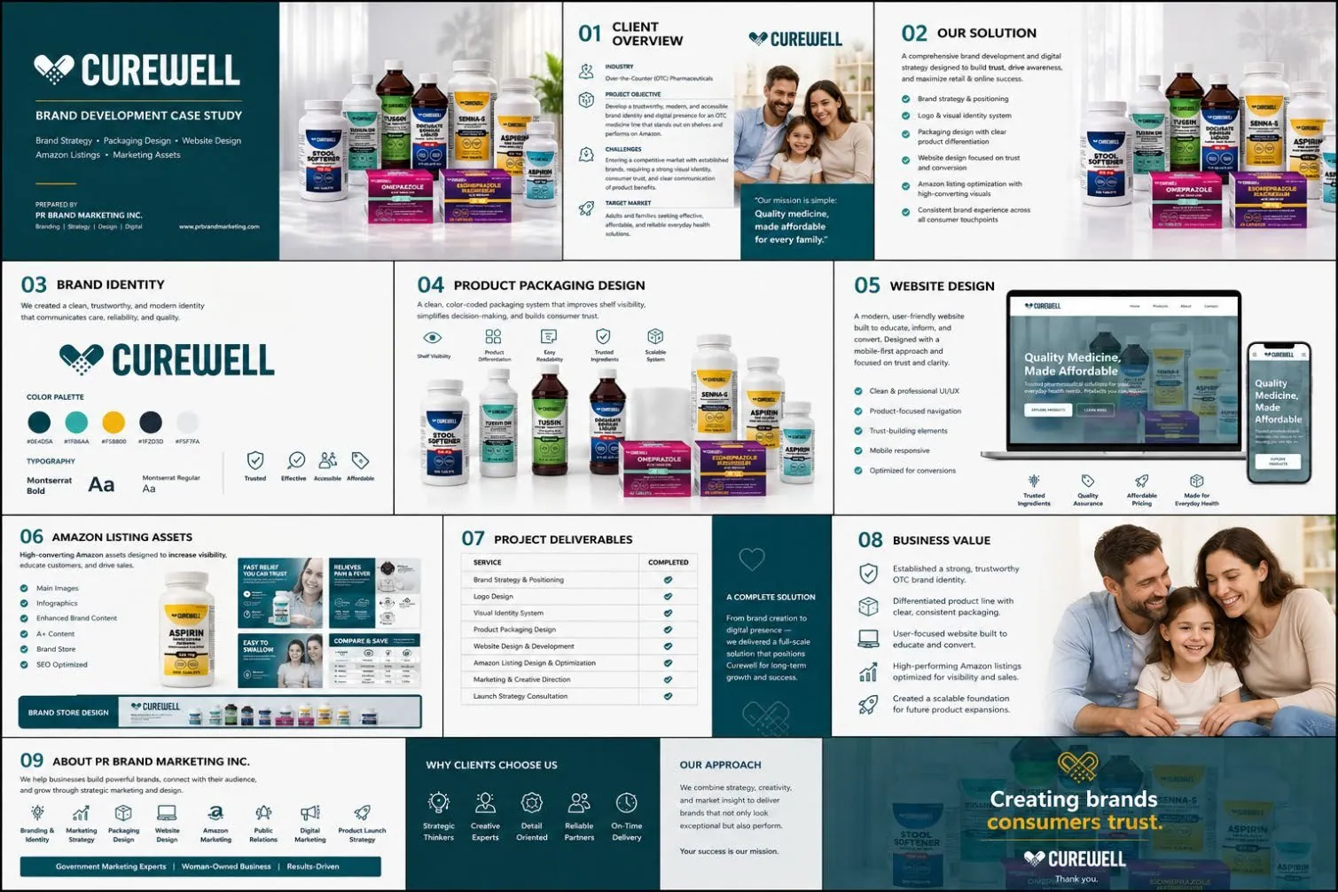
A comprehensive brand development and digital strategy designed to build trust, drive awareness, and maximize retail and online success.
- Client
- Curewell
- Sector
- Over-the-counter (OTC) pharmaceuticals
- Timeframe
- 2026
- Audience
- Adults and families seeking effective, affordable, and reliable everyday health solutions
Services
01 Client challenge
Curewell was entering a competitive market with established brands. To compete, the line needed a strong visual identity, consumer trust, and clear communication of product benefits.
The objective: a trustworthy, modern and accessible brand identity and digital presence for an OTC medicine line that stands out on shelves and performs on Amazon.
“Our mission is simple: Quality medicine, made affordable for every family.”
Curewell’s brand mission
02 PRBM’s role
What we delivered:
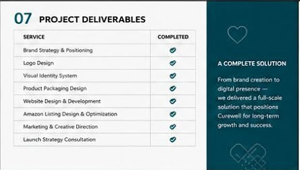
- Brand strategy & positioning
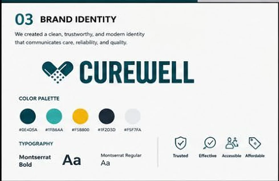
- Logo and visual identity system: color palette, typography and brand values
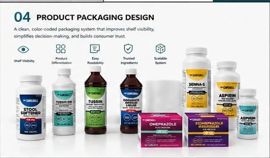
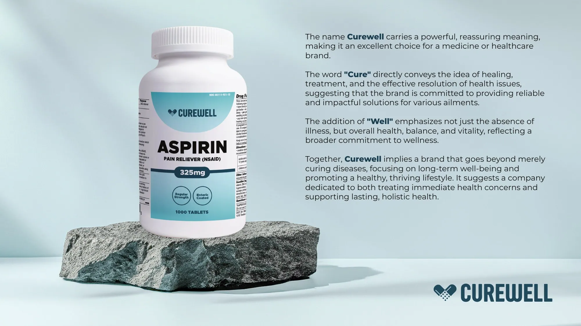
- Color-coded packaging system across the line, including Aspirin, Omeprazole, Esomeprazole, Senna-S, Stool Softener, Docusate Sodium Liquid, Tussin and Tussin DM
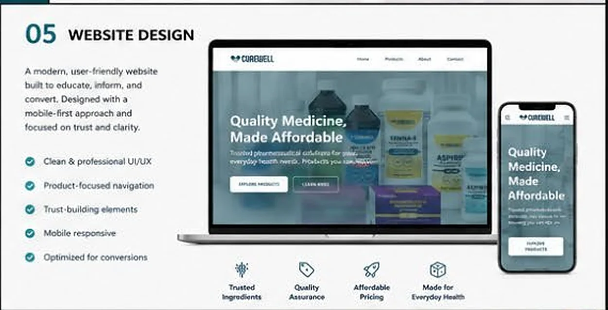
- Website design & development: mobile-first, product-focused navigation, trust-building elements, built to convert
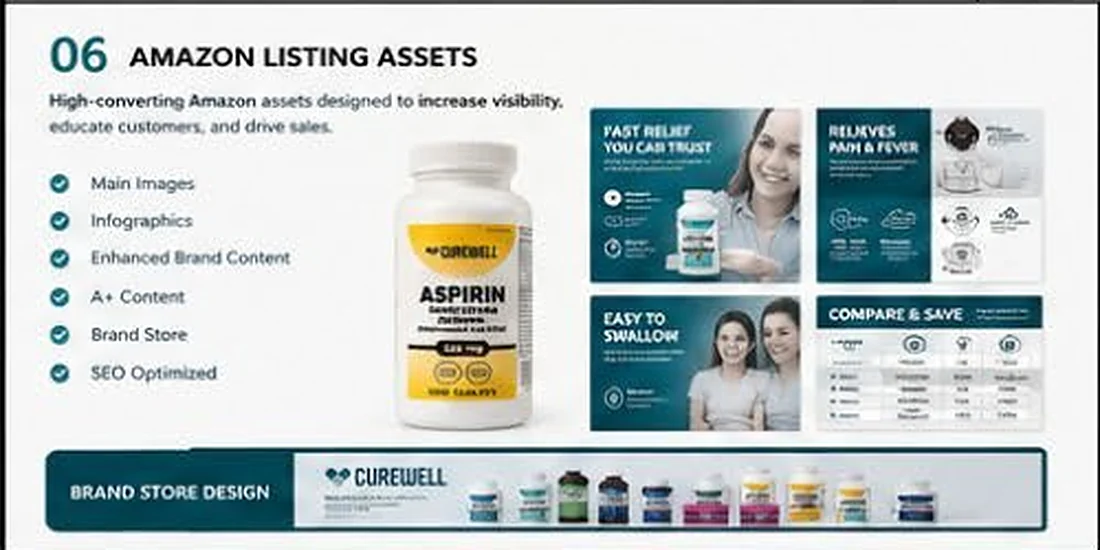
- Amazon assets: main images, infographics, Enhanced Brand Content / A+ content, brand store and SEO-optimized listings
- Marketing & creative direction and launch strategy consultation
03 Creative solution
We set the strategy and positioning first, then created a clean, trustworthy and modern identity that communicates care, reliability and quality, built on four brand values: Trusted, Effective, Accessible, Affordable.
The packaging is a color-coded system that gives each product clear differentiation, improves shelf visibility, simplifies decision-making and builds consumer trust. The website and Amazon listings carry the same system online, designed mobile-first and focused on trust and clarity.
04 Project outcomes
All eight deliverables were completed: a full-scale solution, from brand creation to digital presence, that positions Curewell for long-term growth.
- A strong, trustworthy OTC brand identity
- A differentiated product line with clear, consistent packaging
- A user-focused website built to educate and convert
- Amazon listings optimized for visibility and sales
- A scalable foundation for future product expansion
Relevant codes
- NAICS 541613 Marketing Consulting Services
- NAICS 541430 Graphic Design Services
- NAICS 541511 Custom Computer Programming Services
- GSA SIN 541613 Marketing Consulting
- GSA SIN 541430 Graphic Design Services
- GSA SIN 541511 Web Based Marketing
Reference available. Curewell has authorized us to share them as a reference. Ask for contact details.
05 Gallery Our own case-study boards and designs. Tap any image to enlarge.
Case study 03 · Bakery & café
G’shmak Bakery & Café: brand identity & retail experience
A complete brand development and design solution for a modern bakery and café, delivering a cohesive experience across packaging, retail and digital.
- Client
- G’shmak Bakery & Café
- Sector
- Food service: bakery & café
- Location
- Brooklyn, NY
- Audience
- Families, food lovers and community members
Services
01 Client challenge
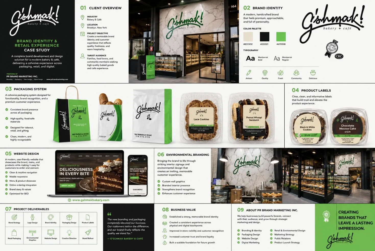
The goal was to create a memorable brand identity and customer experience that reflects quality, freshness and warm hospitality.
For a bakery, the brand shows up in many places at once: the storefront, the boxes and bags, the label on every product, the café walls and the website. All of them needed to feel like one brand.
02 PRBM’s role
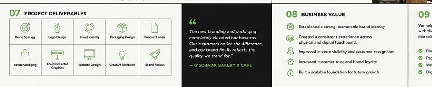
What we delivered:
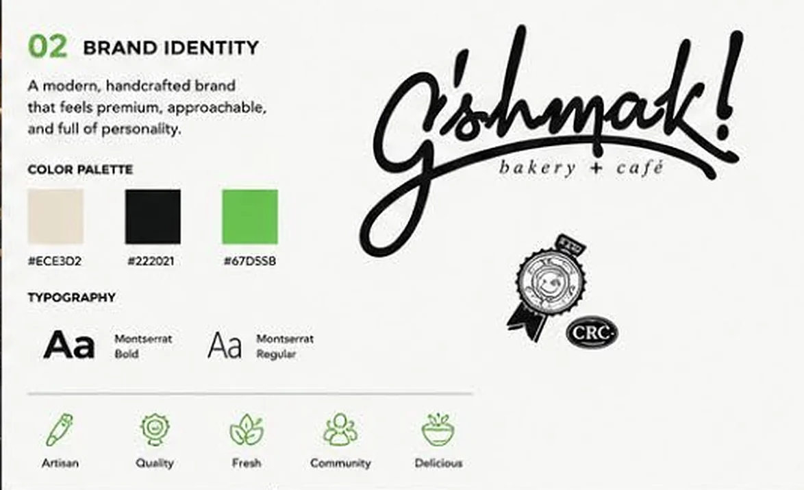
- Logo and brand identity, with brand strategy and creative direction
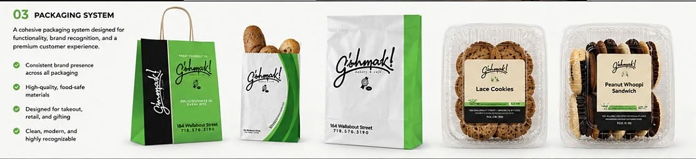
- Packaging system: consistent brand presence, high-quality food-safe materials, designed for takeout, retail and gifting
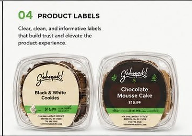
- Product labels: clear, clean and informative
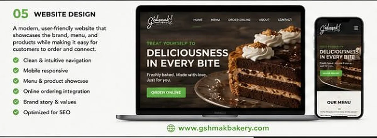
- Website: clean navigation, mobile responsive, menu and product showcase, online ordering integration, brand story and values, optimized for SEO
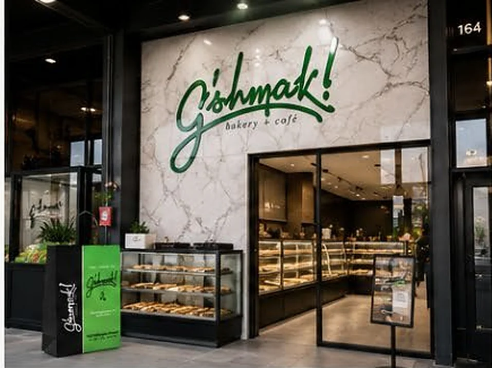
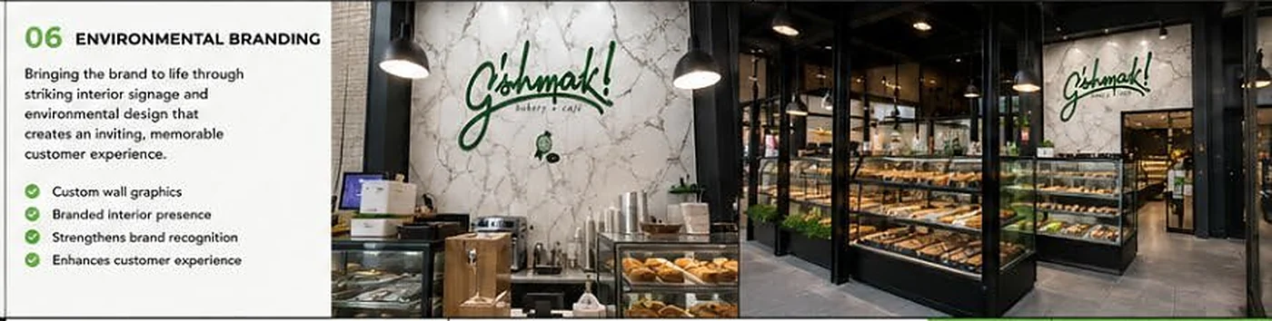
- In-store environmental graphics: custom wall graphics and a branded counter presence
- Brand rollout across physical and digital touchpoints
03 Creative solution
We developed a modern, handcrafted brand that feels premium, approachable and full of personality. Then we rolled it out across every touchpoint: a cohesive packaging system, clear product labels, a website, and interior signage and environmental design that create an inviting, memorable customer experience.
04 Project outcomes
“The new branding and packaging completely elevated our business. Our customers notice the difference, and our brand finally reflects the quality we stand for.”
— G’shmak Bakery & Café
- A strong, memorable brand identity
- A consistent experience across physical and digital touchpoints
- A scalable foundation for future growth
Relevant codes
- NAICS 541430 Graphic Design Services
- NAICS 541613 Marketing Consulting Services
- NAICS 541511 Custom Computer Programming Services
- GSA SIN 541430 Graphic Design Services
- GSA SIN 541613 Marketing Consulting
- GSA SIN 541511 Web Based Marketing
Have a program that needs to be explained clearly?
Full case studies, references and further samples are available on request. Talk to Hannah Giro, Founder & CEO: 917-309-8101 · info@prbrandmarketing.com