
Home / Our Work / Public Sector Concepts / Know Your Home. Know Your Options.
Public Sector Concept 02 · Housing & Resident Communications
Know Your Home. Know Your Options.
Resident Information Campaign Concept
Independent creative concept: not commissioned by a government agency
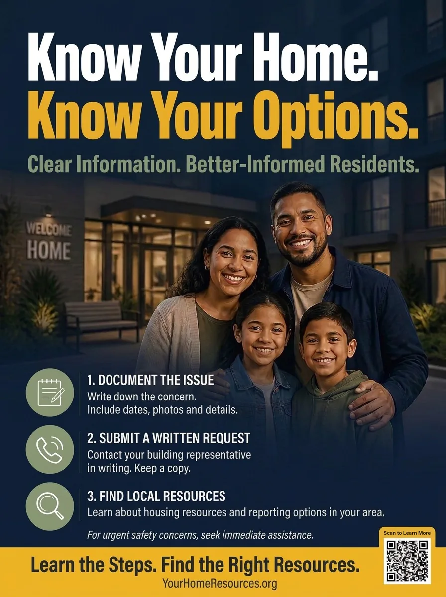
Clear Information. Better-Informed Residents. A resident information campaign concept developed by PR Brand Marketing to demonstrate how a housing agency or property manager could explain a resident’s options in three practical steps, in plain language, in a format that works on a lobby wall.
- Project type
- Independent Creative Concept
- Industry
- Housing & Resident Communications
- Developed by
- PR Brand Marketing Inc.
- Project status
- Independent Portfolio Concept — Not Commissioned by a Government Agency
Capabilities demonstrated
01 Project overview
Helping Residents Understand Their Options
Housing information is some of the most consequential information a public agency communicates, and some of the hardest to communicate well. Residents who do not know how to raise a concern, where to turn or what to expect often do nothing, and small problems become larger ones.
Know Your Home. Know Your Options. is a resident information campaign concept developed by PR Brand Marketing to demonstrate how a housing agency, housing authority or property manager could present a resident’s options as a short, repeatable sequence of steps rather than a wall of policy language.
Built around the headline “Know Your Home. Know Your Options.” and the supporting line “Clear Information. Better-Informed Residents,” the concept pairs warm family photography with a three-step guide: document the issue, submit a written request and find local resources.
The creative concept illustrates how public-facing organizations can turn a process into a poster that residents can read in the lobby, photograph with their phone and act on the same day.
02 The communications challenge
Reaching Residents Who Do Not Know Where to Start
For this independent concept, PR Brand Marketing developed a fictional communications brief for a housing organization whose residents were not using the resources available to them, not because the resources did not exist, but because residents did not know about them or did not trust them.
The brief focused on three challenges:
- Awareness of rights and resources: Many tenants do not know what they are entitled to, how to document a problem or who is responsible for fixing it, so concerns go unreported or are reported in ways that cannot be acted on.
- Language access: Residents read in many languages and at many reading levels. Information that only works in long-form English leaves a large share of a building unreached.
- Trust: Residents who have had poor experiences with building management or official channels are reluctant to come forward. Communications need to feel supportive and practical, not procedural or threatening.
The creative challenge was to make the process feel manageable, three steps rather than a maze, while keeping the tone warm enough that a resident would actually take the first one.
03 Our creative strategy
Three Steps. Plain Language. A Family Residents Recognize.
PR Brand Marketing developed a people-first information concept that treats residents as capable adults who need a clear map, not a warning.
The creative strategy is built around four principles.
- Lead With the Family, Not the Form. Photography of a family at the entrance to their building, under a “Welcome Home” sign, establishes that the message is about their home and their wellbeing before any instruction appears.
- Reduce the Process to Three Steps. Document the issue. Submit a written request. Find local resources. Each step has one line of plain-language guidance and one icon, so the sequence can be remembered without the poster.
- Make the Next Step Concrete. The closing line, “Learn the Steps. Find the Right Resources.”, points to a single destination and a QR code, so a resident can move from reading to acting in one scan.
- Design for the Lobby Wall. Large type, high contrast and a short word count mean the poster reads from across a lobby, in an elevator or on a phone photo.
04 The campaign identity
- Primary campaign headline
- Know Your Home. Know Your Options.
- Supporting message
- Clear Information. Better-Informed Residents.
- Primary call to action
- Learn the Steps. Find the Right Resources.
- The three steps
- 1. Document the Issue · 2. Submit a Written Request · 3. Find Local Resources
- Safety line
- For urgent safety concerns, seek immediate assistance.
Visual identity
The poster uses a palette of deep navy, warm gold and sage green with white type. Navy carries the evening building scene and gives the piece a calm, credible tone; gold highlights the second line of the headline and the closing call-to-action band so the eye moves from the promise to the next step; sage green holds the three step icons so the sequence reads as one system.
A bold, condensed sans-serif headline gives the poster the presence of outdoor advertising, while a lighter weight of the same family carries the step guidance at a comfortable reading size. Simple line icons, a notepad, a phone and a magnifying glass, make each step recognizable without reading.
Deliverables
The concept is developed as one finished piece: a large-format resident information poster for building lobbies, community rooms and resident service offices.
Proposed extensions
The same system is designed to extend, as proposed and not yet produced, to a tri-fold resident guide with more detail per step, a door-hanger or mailbox card for new move-ins, Spanish and other language versions of the poster, a lobby digital-screen loop and a simple mobile page behind the QR code.
Accessibility & multilingual approach
Accessibility was considered as a guiding principle in the concept’s creative direction. The poster incorporates:
- A three-step structure with one idea per line
- Plain-language guidance written at an everyday reading level
- High-contrast white and gold type on navy
- Large headline sizes for reading at a distance
- An icon for each step, readable without the text
- A layout with room for translated versions, including languages that run longer than English
- A QR code as an alternative route to the same information
The portfolio demonstrates accessibility-conscious design principles. Formal accessibility testing, qualified translation review, legal review of the guidance and agency approval would be required before materials could be used in a live resident program.
Concept gallery
The resident information poster
Concept artwork, shown as designed. Tap the image to enlarge.
Large-format print
A large-format resident information poster introduces the headline, the supporting message and the three steps in a single view, intended for building lobbies, elevators, community rooms and resident service offices. The gold band at the foot of the poster carries the call to action and a QR code placement for more information.
05 Project outcome
A Clear, Extendable Resident Information Concept
The outcome of this independent project is a resident information system demonstrating how a housing organization could explain a resident’s options in a format people actually read. The concept includes:
- A campaign headline, supporting message and call to action
- A three-step resident guidance structure with icons
- A large-format resident information poster
- A visual system designed to extend to print, digital and multilingual formats
Together, these elements demonstrate PR Brand Marketing’s approach to turning a process into clear, people-first communications.
This is a speculative portfolio project. No campaign was deployed, no residents were reached, and no performance or behavioral outcomes are claimed.
06 Relevance to government & public-sector clients
Resident-Facing Communications for Housing and Community Programs
The concept illustrates capabilities relevant to housing agencies and authorities, housing preservation and development programs, tenant and community organizations, property managers and prime contractors. These include:
PR Brand Marketing combines strategic communications thinking with creative execution to help public-facing organizations make important information clear, approachable and actionable.
Project disclosure
Know Your Home. Know Your Options. is an independent creative concept developed by PR Brand Marketing Inc. for portfolio demonstration purposes. It was not commissioned, approved, funded or endorsed by any government agency or housing organization. The campaign materials are conceptual, the website address and QR code shown on the poster are placeholders that do not lead to a real service, and no real-world campaign results are represented.
Need a creative partner for your next public awareness campaign?
PR Brand Marketing provides strategic communications, branding, graphic design, digital marketing and outreach creative services for government agencies, prime contractors and organizations. Whether you’re developing an educational initiative, launching a public information campaign or preparing materials for community engagement, our team can help translate your objectives into compelling communications.